
How To Pick The Right Color For Your Curtain
When purchasing a home, most people hanker over what color window treatments to buy. While many factors may affect this decision, such as personal preference, sense of style, furniture type, and a lot more, the most obvious one is the color of your walls. This begs the question, ‘should curtains be lighter or darker than walls?’
Whether your walls are a warm (red, orange, yellows, or beige) or cool (green, blue, purple, or gray) hue, it is often suggested that window treatments be of a similar tone. Choosing a color at least one shade lighter or darker than the version on the wall is recommended. Coordinating curtains or blinds to match the furniture in the room is also a good idea.
Here are a couple of things to help you pick the right color for your curtain.
Matching Curtains To Your Walls
Must curtains match your wall or sofa? Well, you don’t have to worry too much about matching your curtains to your wall and sofa. Sometimes, using varying colors add style to your room.
However, you also have the option to pick curtains that complement your sofas and walls. For instance, blue curtains go well with a blue sofa or wall. As much as possible, avoid using colors that don’t blend well. The general rule is to design rooms with one neutral color or one or two accents. Pick a hue that you like and choose a color palette. Doing this gives you the right color.
For a start, pick a certain color similar to the walls. Doing this reduces the risk of having a poor color combination. This is a great solution if you love the shade of your walls, and you don’t want to create a mess with the overall look.
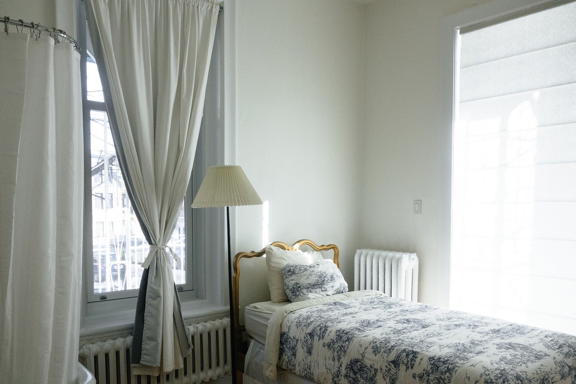
However, you have to replace your curtains once you decide to repaint your walls. The most common approach is sticking with neutral colors. These shades are versatile, which makes beige curtains to be in-demand. Choosing curtains with neutral colors is your safest and cheapest option. There are plenty of available curtains in these shades too. If your walls are in warm shades such as reds and oranges, or cool colors like blues and greens, you may choose curtains with similar tones.
Select a color that has a slightly darker or lighter tone than your walls. But, if you are planning to use contrasting colors, then you need to pick an accent color from the room. It can either be a shade from your rug or the color of your couch or throw pillows.
It is ideal to build a room using a combination of one neutral color and several base colors. You may also need a couple of accent colors for contrast. But, any combination will work as long as you stay within your chosen color palette.
Check Your Room Size
One of the best tips for choosing the right color for your curtains is the size of the room to be decorated. For example, if your bedroom is small, it’d be better to opt for curtains in neutral colors such as white or beige. According to the psychology of color, these provide a very significant amplitude effect. On the other hand, if you have a large room with ample space to decorate, you can use warmer colors in the range of reds, yellows, or oranges. You’ll have a much warmer, more welcoming, and vibrant space.
Of course, consider the colors of the walls, accessories, and decorative elements, the idea is to create a good contrast.
Match Your Curtains To Your Home Decor
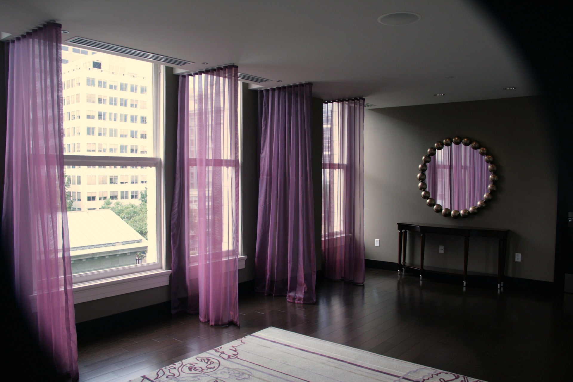
If you want to freshen the look of a room by changing the curtains but don't know how to coordinate window coverings with walls, floors, and furnishings, let your imagination soar. When it comes to color, top designers are disregarding traditional color schemes and using bold colors in tight palettes. Using hues within families of color is the key to bringing it all together. Texture and pattern can highlight, or tone down, colors in the palette. Color can open small spaces, create a niche within a space or minimize large spaces.
When we look at the outside world, there are gradations of dark and light from earth to sky. The earth is dark, often in shades of grey, brown, and terra cotta. The space between earth and sky is full of colors, such as the variegated shades of green in trees, brightly colored flowers, and hues of the built landscape. The sky is brighter and lighter. Many decorators use this gradation from dark to light to coordinate colors in a room.
If your floors are dark, use lighter shades on the vertical plane from floor to ceiling. Window coverings can play to either the light or the dark according to the mood you want to create. For an airy, light-filled space, use lighter colors and lightweight fabrics. To accentuate darker hues, try heavier fabrics that diffuse or block light.
Classic colors also come from nature. The golden-yellow hues of sunshine blend well with shades of green reminiscent of trees or with turquoise seen in the sea and water. Greys and tans evoke rock and sand. If your space is predominantly earth tones, use curtains to add a pop of color. Cherry red or ocher curtains can enliven the room without overwhelming it. Just make sure it is a color you can enjoy for a long time.
Try Out Classic Color Combinations
Some color combinations never go out of style. Perhaps the most classic is black and white. Black evokes a feeling of formality and dignity. White gives a feeling of light and purity. If you have white walls, pick a soft shade of black for windows. The dark curtains contrasting with the light walls create a focal point at the window. A soft shade of black offsets the dense saturation of pure black. Layering gives the best of both worlds. Use the dark color for mood, thermal insulation or to keep light out. White sheers give privacy as well as light when the dark curtains are open.
Many designers combine hues of orange with shades of blue. Navy and tangerine or sky blue and persimmon are examples. Playoff these colors with hues in the same family. Texture can be used to accentuate a shade. The pattern can combine several colors that echo the palette of the room.
Blue and white are a favorite combination. The many shades of blue, as diverse as cobalt blue, navy, turquoise, denim, and robin's egg, all contrast nicely with white. Patterns set a theme. Gingham and plaids give a country feel, while geometric prints complement a modern or minimalist theme. Paisleys or repeating patterns in large motifs play up the window. Curtains without patterns soften the window. Although patterns may highlight a dominant color of the room, patterns can also echo other shades.
Another way to use classic color combinations is to pick two predominant colors from the room and expand the palette by adding color from the same family. Several designers recommend using a scale of 60-30-10 to balance color. If you have a predominant color in the room, customized curtains online can balance the ratio. For example, in a room with a predominance of navy blue and a secondary color of deep reds, curtains can combine secondary and accent colors without overwhelming the scheme. Pillows, throw rugs and other accessories can play up color and pattern.